
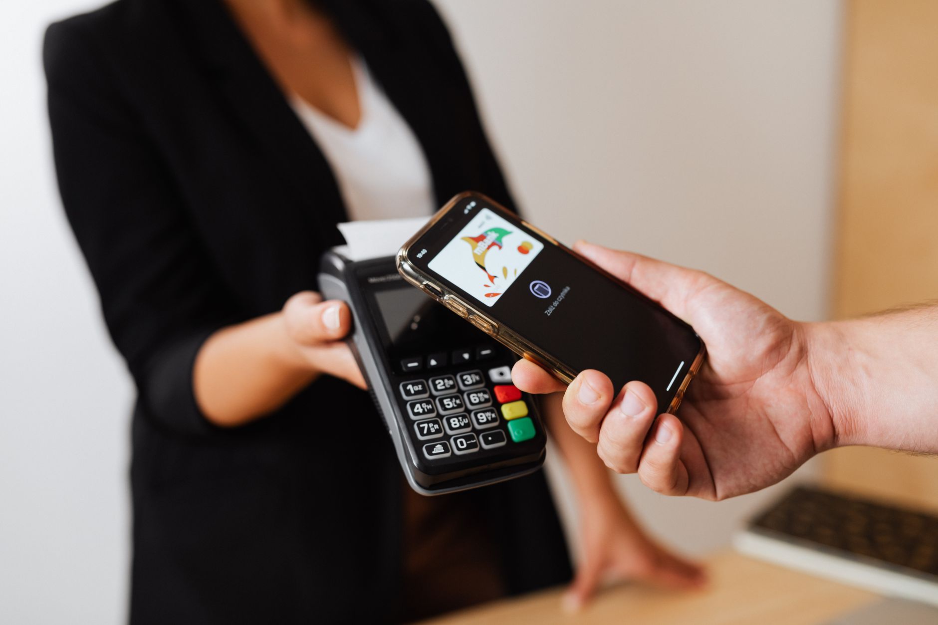
Google is pushing out a significant interface update for Wallet on Android devices, swapping out the familiar horizontal card carousel for a vertical stacked list. The redesign allows users to view multiple credit, debit, and transit cards simultaneously without having to swipe endlessly through individual entries. This layout adjustment follows earlier tweaks to the app's homepage architecture earlier this year, signaling a broader effort by the design team to streamline daily transactions and reduce friction at checkout points.
Transitioning from a side-scrolling view to a vertical stack brings notable ergonomic improvements for one-handed smartphone use. When users tap their primary payment method, the remaining cards fan out cleanly below or above, maintaining legibility while keeping the interface uncluttered. Early testers note that finding secondary loyalty cards or boarding passes feels considerably faster, addressing long-standing complaints about navigation depth within the app during high-stress scenarios like airport gates or crowded subway turnstiles.
The rollout is currently happening via a server-side update for Android users running the latest versions of Google Play Services and the Wallet app. As Google continues to pack more functionality into the digital passbook—ranging from digital IDs to event tickets—optimizing screen real estate remains critical. Expect the stacked view to become the default standard across all compatible devices over the coming weeks as the deployment widens globally.




Comments